Building My Spending Tracker
Spending Tracker is a mobile application I created and have been using for more than a year. It was designed to record and organize transactions for better transparency on personal spending. This personal project took 2 months to complete.
Understanding The Problem
I conducted brainstorm of pain points of how I currently manage my spending and budgeting. My findings revealed that:
- Spending was split across multiple financial instituitions and I had to manually consolidate the data every month
- Spending data is not easy to organize which makes it harder to identify trends and adjust habits accordingly
Defining The MVP
From these findings, I was able to better understand the objectives of this project. The core features of the MVP were to:
- Have a history of all my spending available in one convenient place
- Organize spending by categories and source (bank account, credit cards, etc)
- Automatically ingest data from banks and financial instituitions
- User accounts, authentication, and profile management
These requirements of the MVP are quite complicated and were further split into appropriately sized career for myself. The screens decided for this mobile application were:
- Login screen
- Wallet screen
- Card transactions screen
- Card spending summary screen
- Recent activity screen
- Categories screen
- Manage cards screen
- Personal information screen
- Change password screen
- Settings screen
Designs
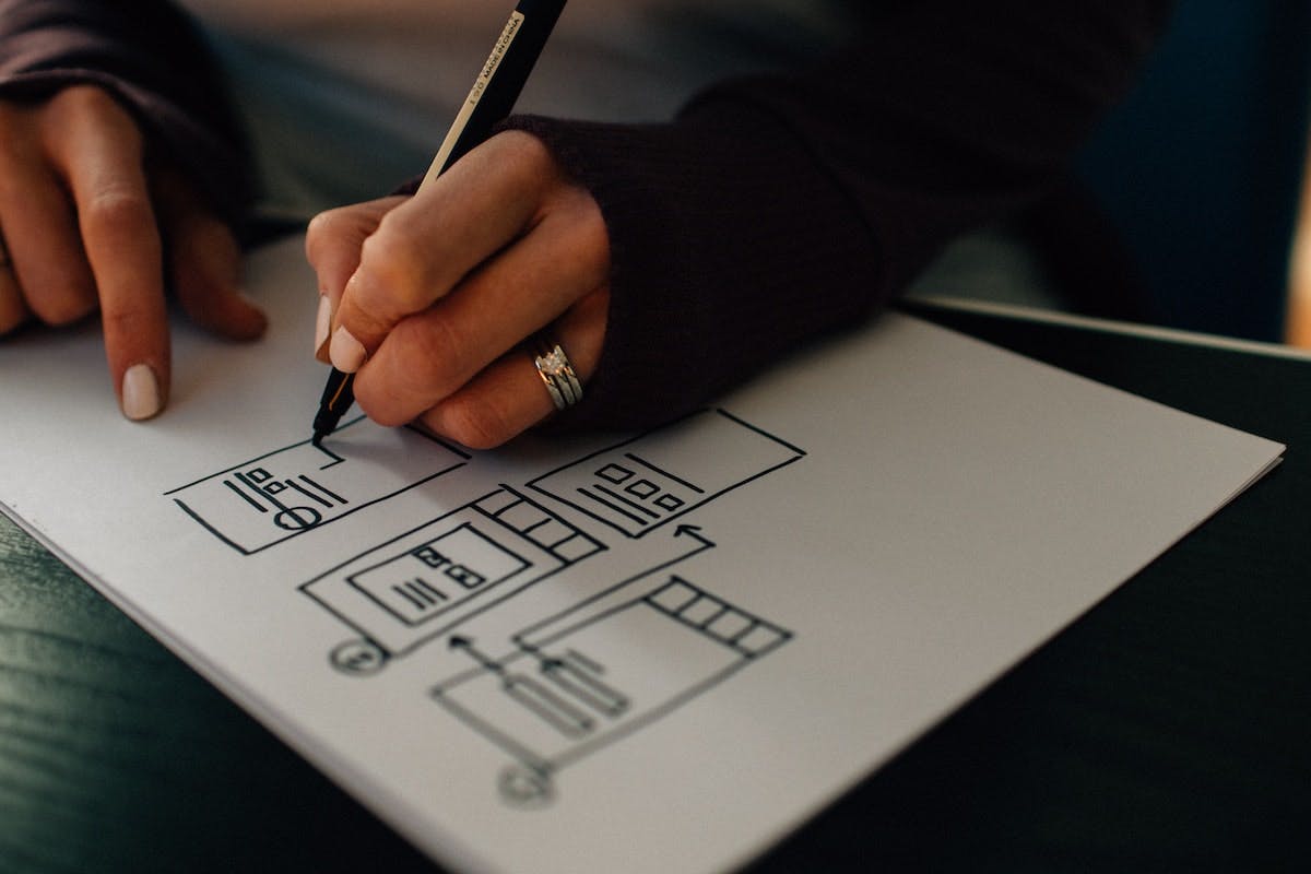
I'm a big fan of minimalism and super simple user interfaces. I quickly put together rough sketches of the screen designs and user flows.
Afterwards, I finalized the designs and created high fidelity ones with inspiration from Behance and Dribbble.
Once the designs were complete, I did a technical system design of the application's full stack and developed it. I created a test account and this is what the end result looked like:
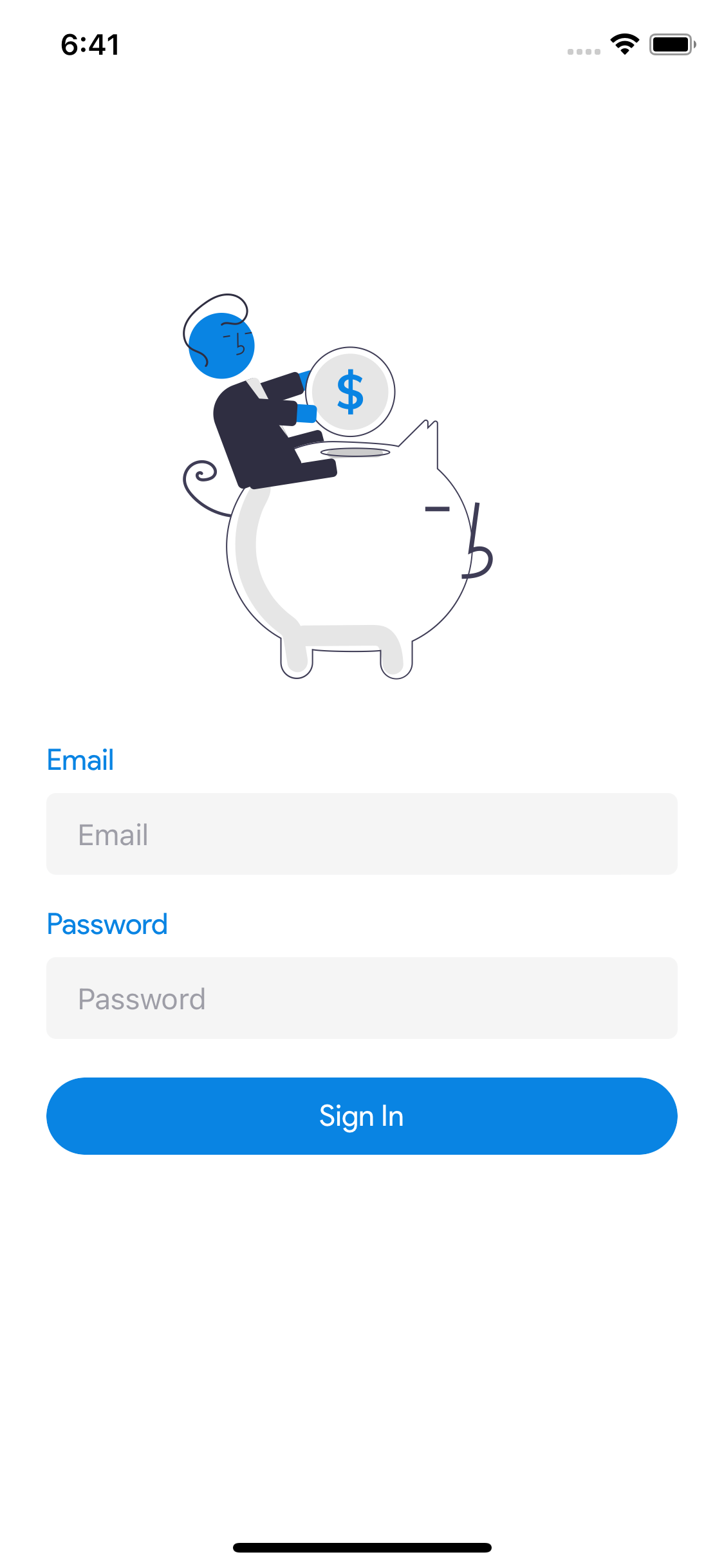
Login Screen
A simple generic login screen with a simple graphic for saving money. It'd be best to update it with a logo for branding if the application were to ever go public.
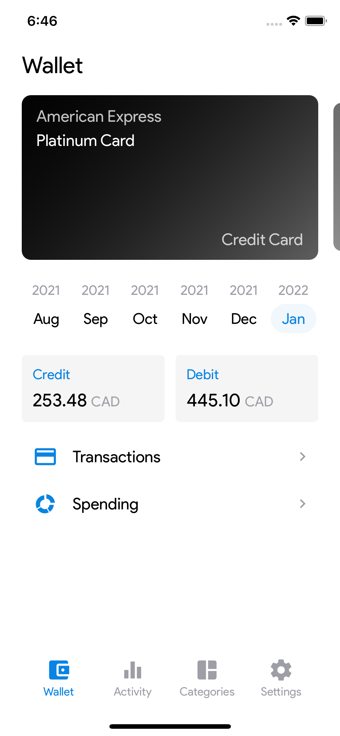
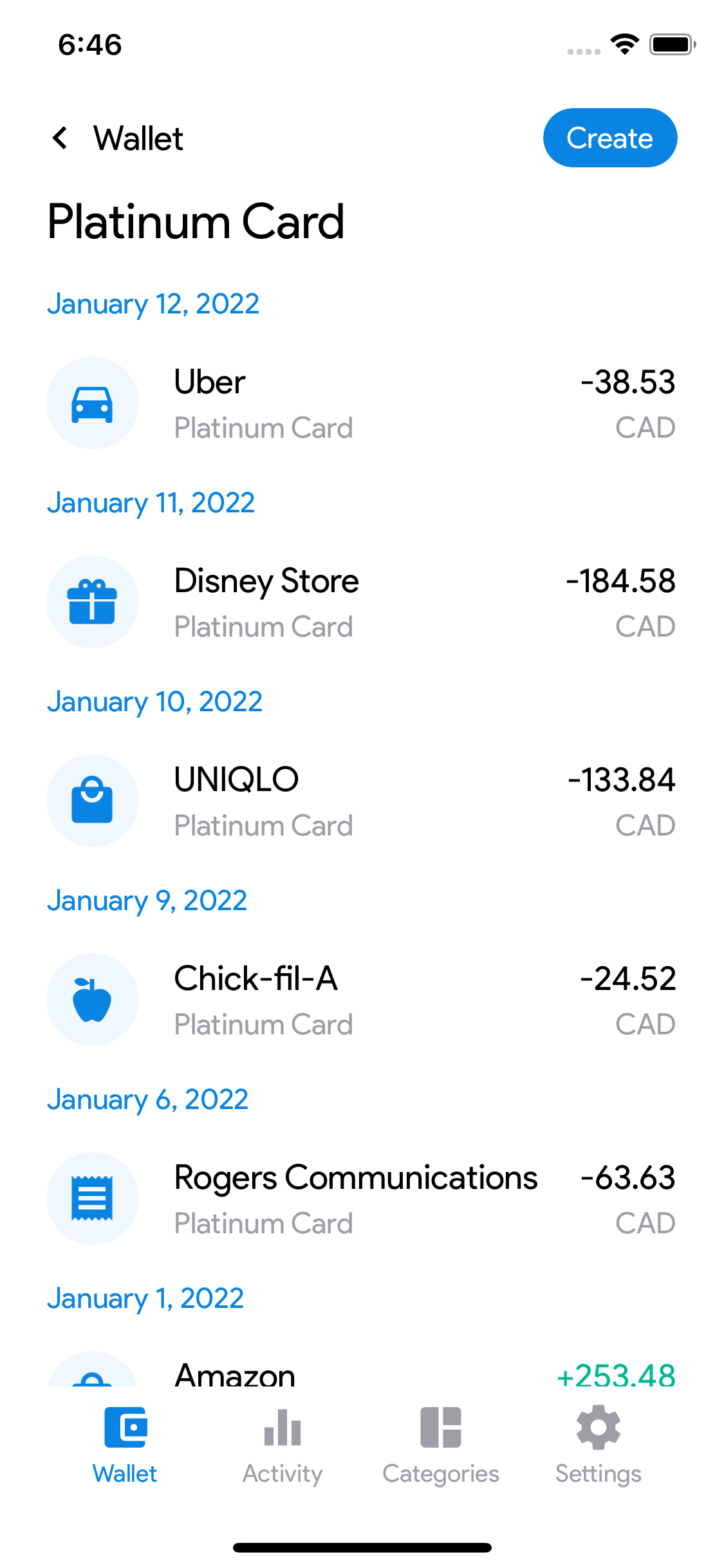
Wallet Screen
A quick overview of their transactions organized by cards and month with shortcuts to the transaction list and breakdown of spending by category for each summary.
Card Transactions Screen
A list transactions with a filter for a given card and month. The user can manage their transactions by long pressing on a transaction. This screen can only be accessed from the wallet screen.
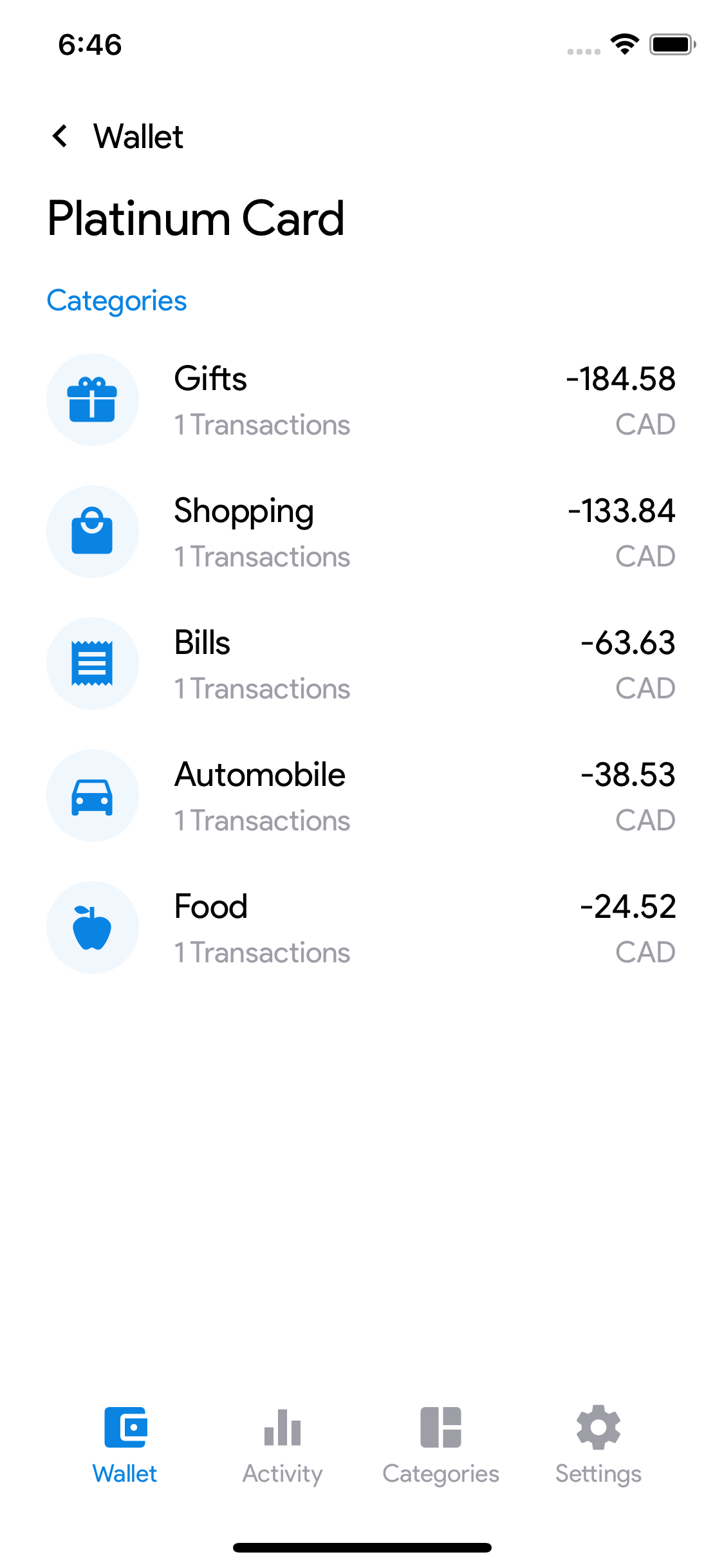
Card Spending Summary Screen
A breakdown of spending by category filtered for a given card and month. This screen can only be accessed from the wallet screen.
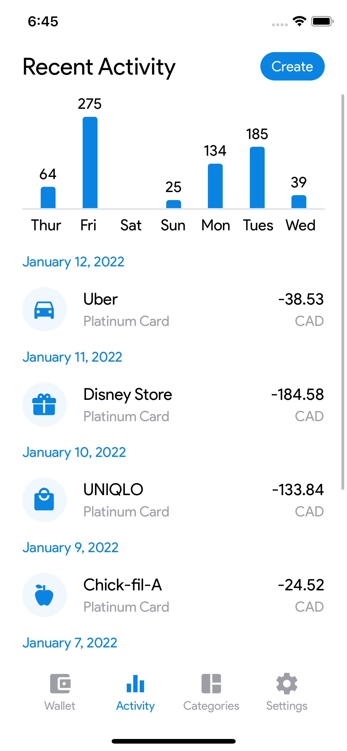
Recent Activity Screen
A list of transactions that were most recently posted where users can add, edit, and delete transactions from this screen.
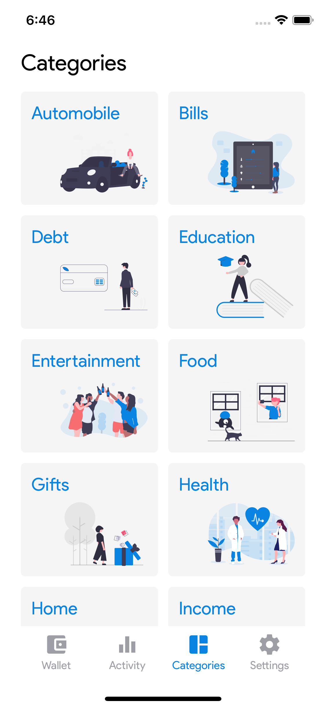
Categories Screen
A grid of categories tiles where the user can view a list of transactions for a given category.
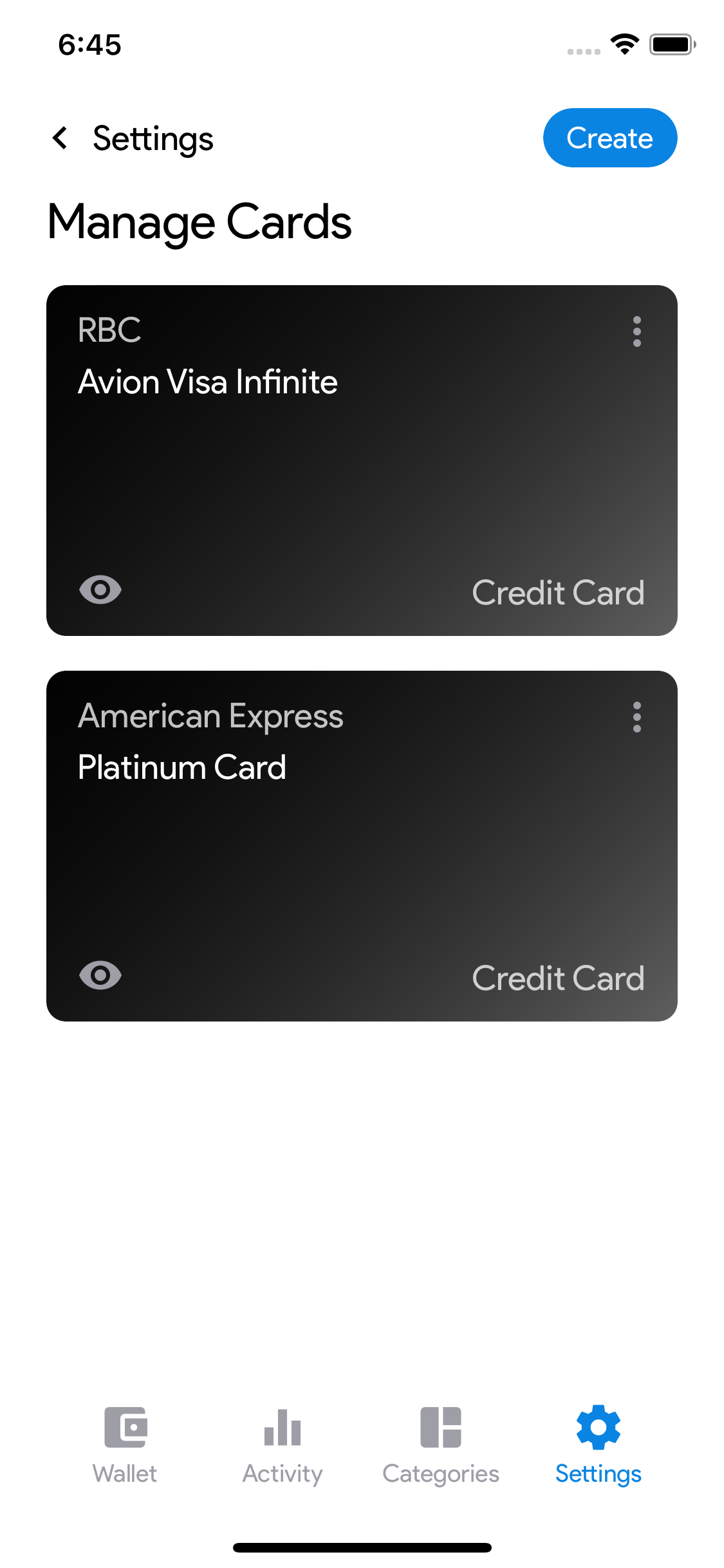
Manage Cards Screen
Users can create, edit, and delete cards to better organize transactions.
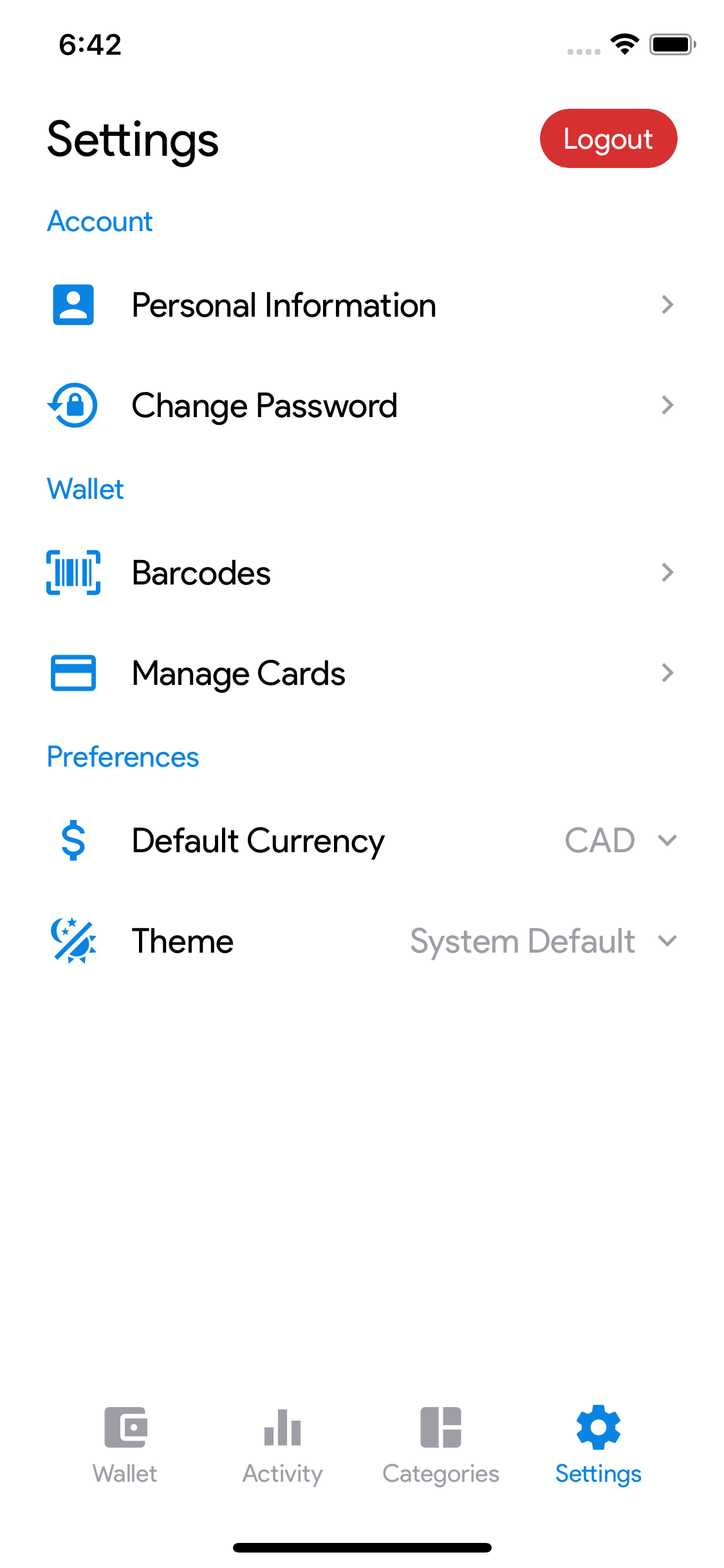
Settings Screen
A list of shortcuts to access screens for account management, card management, and preferences.
Development
The key technologies I used to build this application are React Native, Node.js, GraphQL, MongoDB, and Docker.
I went with a microservice architecture for some benefits such as independent deployability, scalability, and code independence. GraphQL was implemented as an API query layer and the intermediate between clients and microservices. Each service is packaged into Docker containers and deployed to AWS.
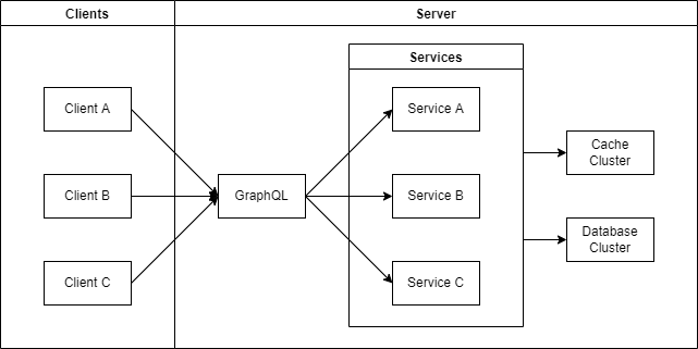
This system design was simple and doesn't have many scaling techniques in place because I was the only user. Inserting a load balancer and horizontally scaling the GraphQL nodes should be able to support handling heavier traffic in the possibility of a public release.
Unfortunately, I was not able to automate data ingestion from banks and other financial institutions because that kind of data is not available to the public. As an alternative, I was able to export my transactions to an excel spreadsheet for each of my financial statements and from there I could easily bulk upload the transactions into my application. This was more of a compromise I had to come to terms with but at least I didn't have to manually record every transaction.
Results & Takeaways
Some key takeaways from this personal project are that:
- Taking the time to plan goes a long way. Many developers like to rush right into developing their personal projects, but taking the time to plan makes it so much easier.
- Experiencing your product leads to improvement. I was actively using the mobile application which made it easier to identify pain points. Many tech companies use this approach such as DoorDash.
- Catch bugs before they bite you. Setting up tests is very useful into the development process is crucial even if its a personal project so bugs don't make it into production.